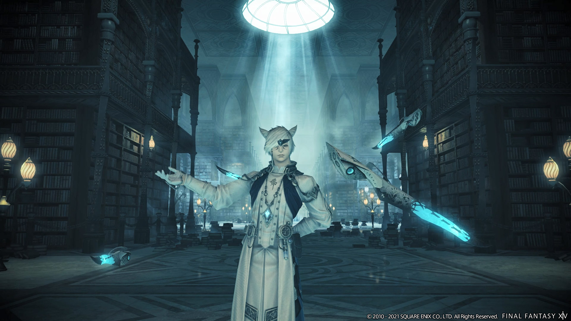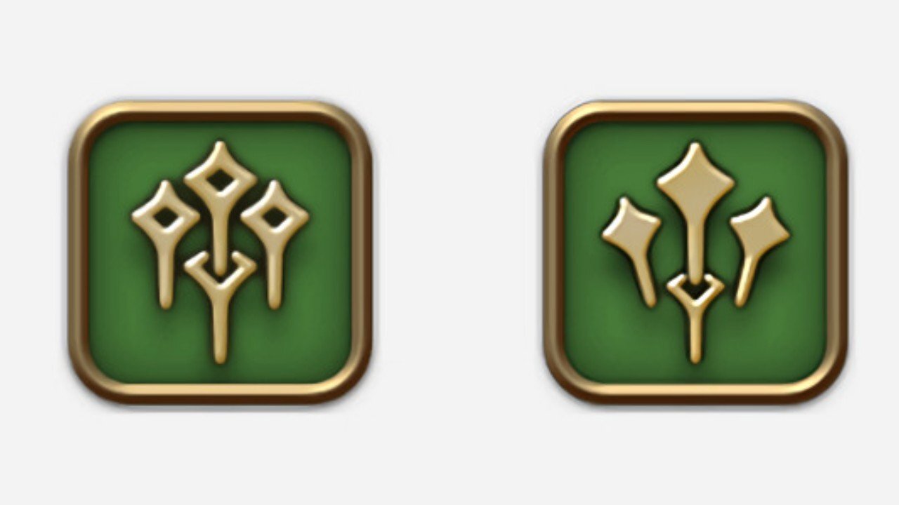
Sage is one of the two upcoming jobs coming to the Final Fantasy XIV: Endwalker expansion. It will be a class focused on healing and using barriers to fortify the defense of its allies while using Nouliths to channel aether to attack its adversaries. However, the designers of the MMO probably didn’t expect to receive such criticism about their design choices regarding the icon for the class. Sage’s icon represents the four weapons it uses. However, some players with Trypophobia complained about the decision to include closely packed holes in the icon design. As a result, Square Enix has to change the Final Fantasy XIV icon to make the players feel more embodied.

After Square Enix showcased the new icon for Final Fantasy XIV, some players reported feeling “uncomfortable” and “fearful” because it stimulated their Trypophobia — an irrational fear of closely packed holes. Similar to many phobias, the severity of the condition may vary from person to person. However, it can have severe reactions for some people. Since then, Square Enix has slightly redesigned the new icon to remove the closely packed holes completely.
In a statement posted on the game’s official website, the producer and director for Final Fantasy XIV, Naoki Yoshida, explained why they decided to make the changes. “When we released new details for sage and reaper on the special site, we also included their icons, not thinking that they were particularly big reveals. However, we soon received feedback from players all over the world, who told us that the sage icon made them uncomfortable or fearful,” he said. “But regardless of such differences, you have given us your earnest feedback, and there’s still time to change things. Considering also the fact that job icons are prominently visible in the game, and that they also appear on merchandise, we’ve made the decision to redesign the sage icon.”
The re-designed icon retains the concept of the four levitating blades used by Sage but completely removes the holes inside the blades. “The design concept is unchanged,” said Naoki Yoshida. It’s really admirable of Square Enix to change the Final Fantasy XIV icon and make the players feel heard regardless of them being in a minority. The response from Naoki Yoshida is commendable and we expect the same from other developers in the future!
Thanks! Do share your feedback with us. ⚡
How can we make this post better? Your help would be appreciated. ✍


